Projects
Programming & Technical Skills
- Languages: Python, Scala, MATLAB, R, Mathematica, SageMath
- Tools: Git, Linux, Mac OS, Windows, Triton Cloud
Certificates
- Machine Learning (Coursera), Elements of AI & Building AI (University of Helsinki)
- SQL for Data Science, Neural Networks and Deep Learning
Selected Computational Projects
Project Summary:
This project investigates the relationship between cognitive performance and independent living among elderly individuals (aged 75 and above) in Finland. Using data from the Finnish Institute for Health and Welfare (THL) and Sotkanet, the study spans the years 2017–2019. It integrates spatial, statistical, and demographic data to identify trends, correlations, and spatial distributions at the municipal level.
1. Cognitive Performance Scale (CPS)
The Cognitive Performance Scale (CPS) ranges from 0 (intact cognition) to 6 (severe cognitive impairment). The average CPS scores were analyzed per municipality for individuals aged 75 and older.
2. Percentage Living at Home
The percentage of individuals aged 75+ who continue to reside in their own homes. This excludes institutionalized or 24-hour care housing.
3. Relationship Analysis
A regression analysis revealed a statistically significant yet modest positive correlation between the CPS score and the percentage of elderly living at home. Municipalities with more independent elderly residents also tend to have better cognitive scores.
4. CPS vs. Living at Home by Category
CPS vs. Living at Home (by Population Category)
5. Technical Tools
Analysis was conducted in R using packages like ggplot2, dplyr, sf, and psych. Spatial visualizations used shapefiles from Paikkatietohakemisto. Missing data was imputed using municipal averages.
6. Implications
These findings suggest that enabling independent living may benefit cognitive health among the elderly. However, further exploration into other contributing factors is necessary.
Project Summary:
In this project, I developed a data-driven method to optimize the daily scheduling of field maintenance tasks. The goal was to group and assign hundreds of geographically distributed tasks across several days in a way that balances the workload and minimizes travel.
Interactive Route Map
As part of the task scheduling and route optimization project, I created an interactive map that visualizes the weekly maintenance tasks across seven weeks. Each task is geolocated using latitude and longitude coordinates extracted from daily route files.
How the Map Is Organized
The map allows users to explore how tasks are distributed across both weeks and weekdays (Monday to Friday). For each week, the tasks are grouped by day and color-coded for visual clarity:
- Monday – Red
- Tuesday – Blue
- Wednesday – Green
- Thursday – Purple
- Friday – Orange
These groupings are toggleable using a layer control panel, so users can focus on one week or one specific day at a time. Each marker displays the location’s coordinates and the day it was scheduled for.
Purpose of the Visualization
This map serves as a practical way to verify that the task scheduling was spatially balanced. By visually inspecting the distribution of tasks, one can confirm that:
- Each day's route covers a specific region, avoiding unnecessary overlap,
- The number of tasks per day appears balanced,
- Tasks selected through the scattering heuristic are well-distributed, and
- Remaining tasks are assigned to the most appropriate route clusters.
Tools and Technologies Used
- R – for data cleaning, clustering, route assignment, and CSV generation
- Python – for reading CSV files and generating interactive maps using
folium - Google Maps Directions API – for retrieving route data and coordinate paths between task locations
- Geospatial analysis libraries
- HTML/CSS
Outcome
The resulting map provides an intuitive, interactive way to review the outputs of the optimization algorithm. It demonstrates how data-driven heuristics and spatial logic can be combined to produce efficient, real-world routing solutions. This tool could be directly used by planning teams or further extended for real-time routing applications.
Interactive Route Map (Weeks 1–7)
Below you can explore the interactive route map. Use the layer control to toggle between weeks and days, and click on markers to view task locations.
Project Summary:
Developed a symbolic algorithm using SageMath and SymPy to compute border ranks of small 3D tensors. The project integrated combinatorial enumeration with exact linear algebra techniques and was parallelised using SCOOP on the Triton Cloud. These results contributed to advancing research in algebraic complexity and tensor decomposition.
Tools & Techniques
- SageMath & SymPy (symbolic computation)
- Parallel computing with SCOOP
- Triton Cloud (Aalto University’s HPC infrastructure)
- Applications in tensor decomposition and algebraic complexity theory
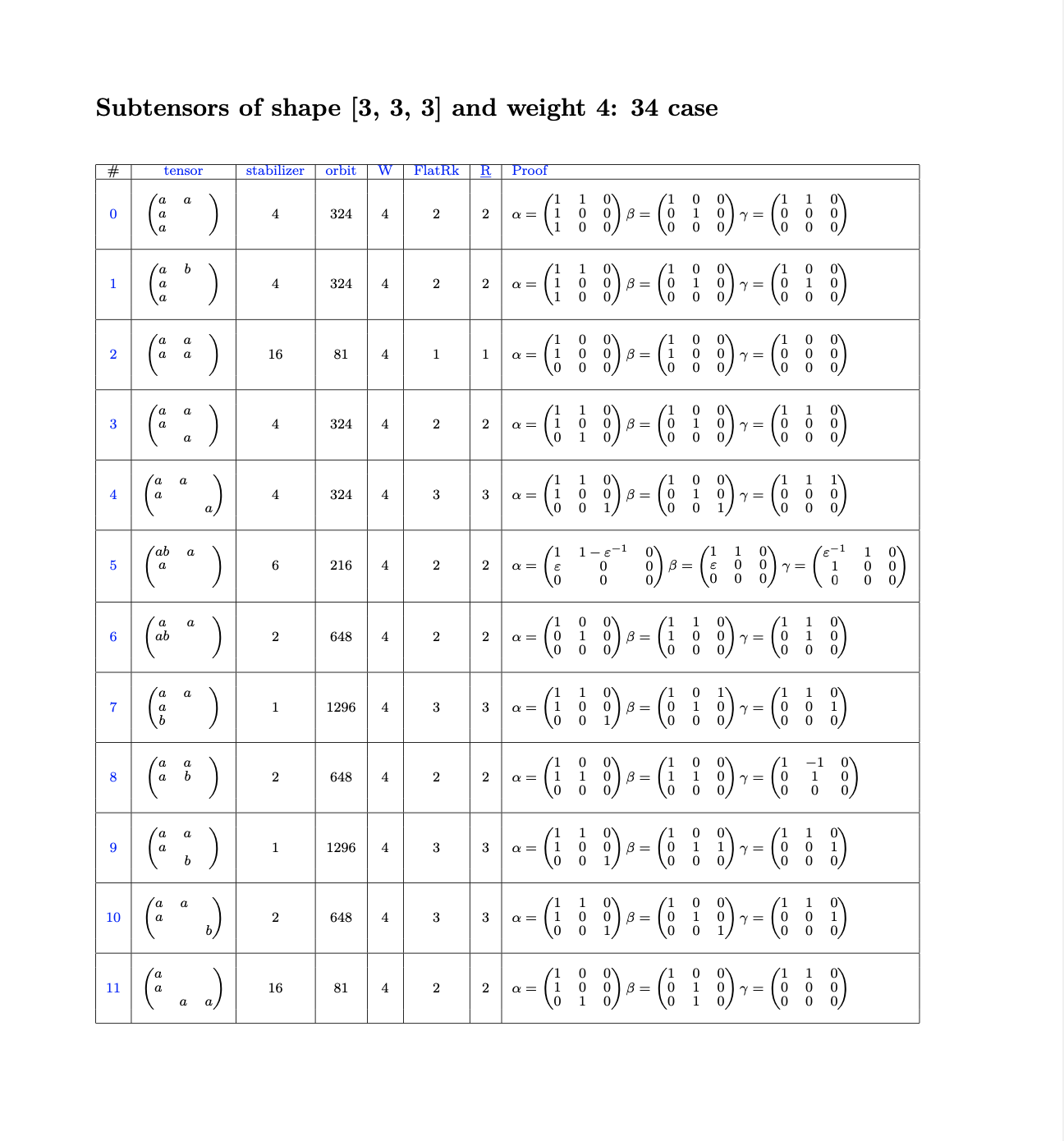
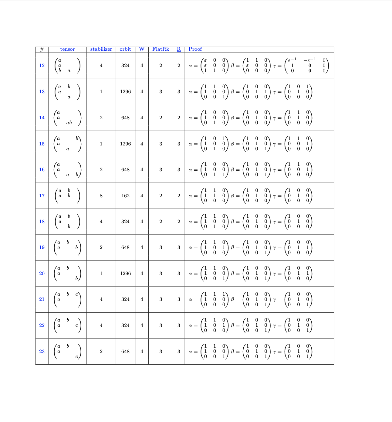
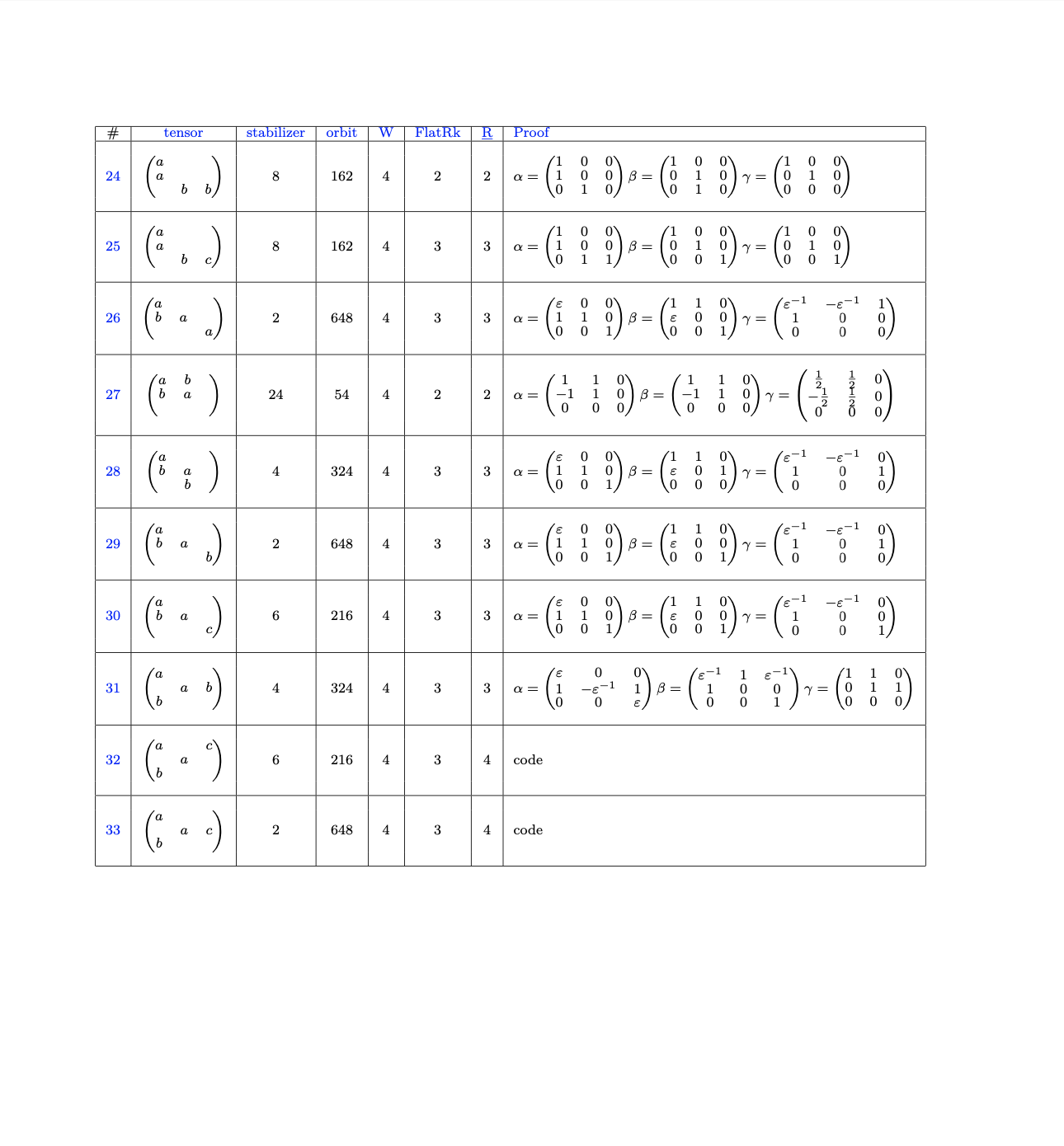
Border Rank Computation of 3D Tensors
The following preview presents selected pages from my tensor analysis work, which applies symbolic algorithms to compute the border rank of small 3-dimensional tensors. The computations involve combinatorial enumeration, symmetry analysis, and exact algebraic methods. The examples shown below—such as tensors #32 and #33—demonstrate nontrivial decompositions whose border ranks were determined using my code, implemented in Python and SageMath and run on the Triton Cloud. These tensors contribute to advancing research in algebraic complexity theory.
Project Summary:
Developed a machine learning pipeline to identify early signs of financial distress in small and medium-sized enterprises. The project uses a publicly available dataset of financial indicators (e.g., profitability, liquidity, leverage, efficiency) to predict bankruptcy and highlight key risk factors. The goal is to support early intervention and smarter credit risk evaluation.
Tools & Techniques
- Python: pandas, scikit-learn, XGBoost, SHAP
- R: survival analysis, Bayesian logistic regression
- Visualization: SHAP values, correlation heatmaps, class distributions
- Data: Public SME bankruptcy dataset with 90+ financial features
Key Features Used in the Model
- Profitability: ROA, Operating Margin, Net Profit Growth
- Liquidity: Current Ratio, Quick Ratio, Cash Flow Ratios
- Leverage: Debt-to-Equity, Interest Coverage, DFL
- Efficiency: Asset Turnover, Inventory Turnover
- Growth and Stability: Net Value Growth, EPS, Retained Earnings
Outcome
Top 15 Most Important Financial Indicators
The following plot shows the top 15 features that contributed most to the bankruptcy prediction model, based on Random Forest feature importance scores.
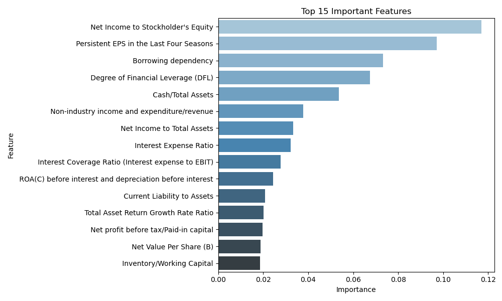
The model achieved strong predictive performance and produced interpretable results using SHAP analysis. Results can be used by financial institutions to monitor SMEs and design early support measures.